TL;DR
Graph memory-usage over time, correlate with logs, profit.
Overconfidence
Recently, I had to reduce the memory consumption of a Python process that became entirely unreasonable. Now, a while back I wrote about finding memory leaks in Python. I was pleased with myself and sure that with the knowledge I gained then, I can surely get this done!
And oh, was I wrong…
Harsh Reality
You see, both pympler and tracemalloc are wonderful tools. But like all tools, they have limitations. When you have a long-running (days) process with many (hundreds of millions) objects, the memory and performance costs of your tools add up quite significantly. Waiting for pympler to query all objects takes forever, and following references is completely impractical; viewing tracemalloc statistics is nice, but doesn’t help you narrow things down enough.
So, after 2 weeks of zero-to-minimal improvements (though I was sure I’m on the right track) I decided to try a different approach to understanding the memory usage of my code.
To The Rescue
Enter memlog.py.
memlog is a simple, naive tool. It tracks the overall memory usage on a machine, and logs it (with a timestamp) to a CSV. That’s it. While the recorded data may include significant noise, running your code (& memlog) inside a container can reduce it significantly. Also, background memory noise tends to be insignificant when your process hogging all of your memory…
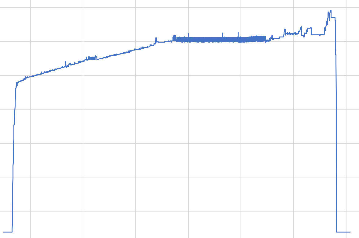
So, I ran my process (with logs), ran memlog, and plotted a memory-over-time graph:

And oh, oh no.
Insight
Looking at the graph, we can divide it into 3 parts:
- A near-instant rise at the beginning. This is by far the bulk of the memory-usage increase;
- A slow, gradual increase over the entire time-scale;
- A near-instant drop in memory-usage.
Those parts are basically:
- Loading the data-set and various initialization;
- The bulk of the processing;
- Program termination.
And for the past 2 weeks I’ve been busy reducing the memory-usage of… the second part. Being absolutely sure it’s the most significant.
So yeah, that hurt. But only for a short time. For you see, with this newfound knowledge I could safely focus on the first few minutes of execution and disregard the rest for the time being.
True. I’ll have to test the whole thing once I’m make any significant changes. Memory-usage might spike at a later point. Memory-optimization may cause performance degradation. But unless I reduce that uptick at the beginning I won’t get any significant improvements.
Profit
A week later, we managed to reduce memory-usage by 30% while reducing overall processing time by a similar percentage. We had to:
- Add a de-duplicating weakref based cache;
- Add a pre-processing step;
- Make our code more cache-friendly by sorting our data;
- Remove a massively over-engineered control mechanism.
But it was all made possible by focusing on the right part. Had I not plotted that memory graph, I could’ve easily spent another 2 weeks without any significant progress.
Old & Wise
So whatever you do, I highly suggest you graph your data. No need to be smart about it. Log it, graph it, correlate to your logs.